PROJECT - BUCCANEER BRAWL
ROLE: UI/UX DESIGNER
PROJECT-LENGTH: 4.5 WEEKS
TEAM-SIZE: 8
GENRE: TURN-BASED STRATEGY
Download Unavailable

Core Tasks
-UI Research
-Interface Design
-User Journey Design
-UI Implementation & Functionality
OVERVIEW
Buccaneer Brawl is a 3v3 turn-based strategy game built in Unreal Engine 5. The project consists of two rounds of combat where the player takes control of three characters all with different actions and must defeat the enemies to win.
This project was completed as a part of my Rapid Games Design module where I was the UI/UX designer in a team of 8. In this role I wore many hats; my primary workload was the design of the user interface and the user’s journey when interacting with the widgets. Besides wireframes and IA diagrams, in the later stages of development my work moved more towards the engine where I implemented art assets provided by our teams UI artist and created the UIs functionality though unreal engine’s blueprints.
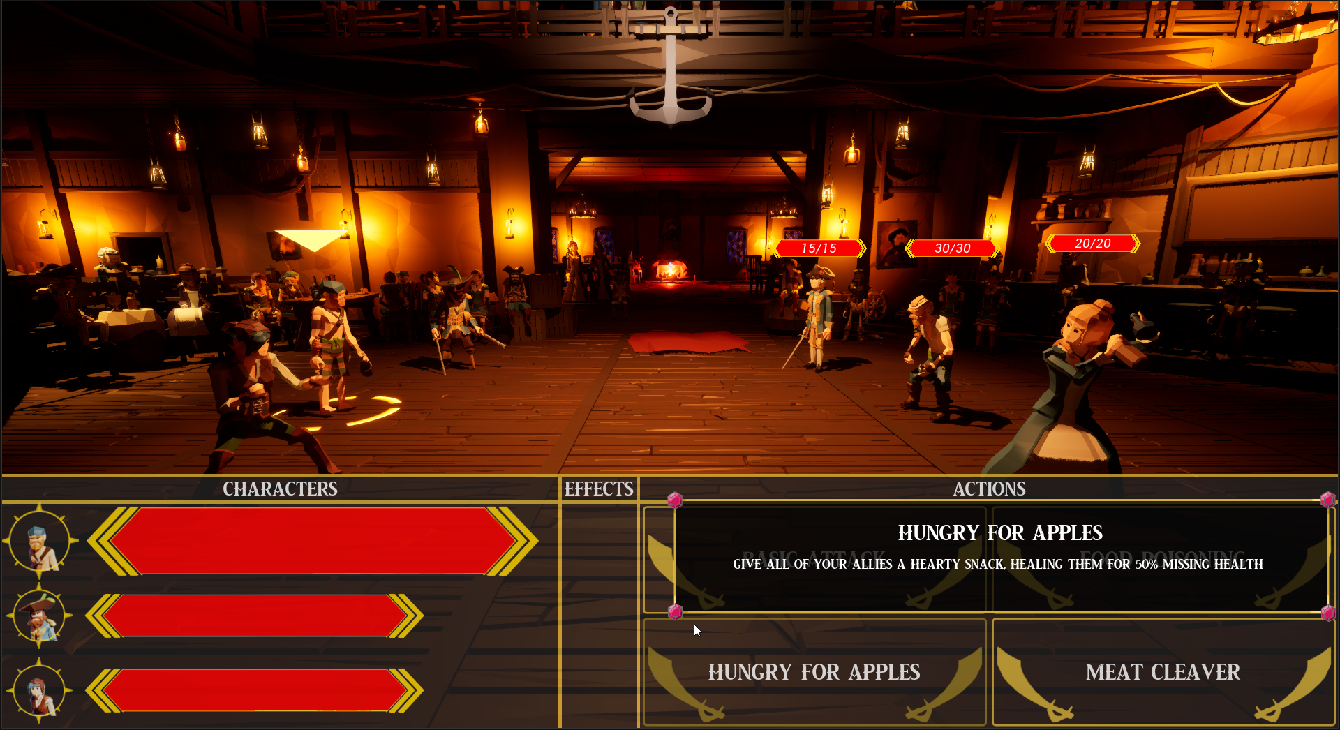
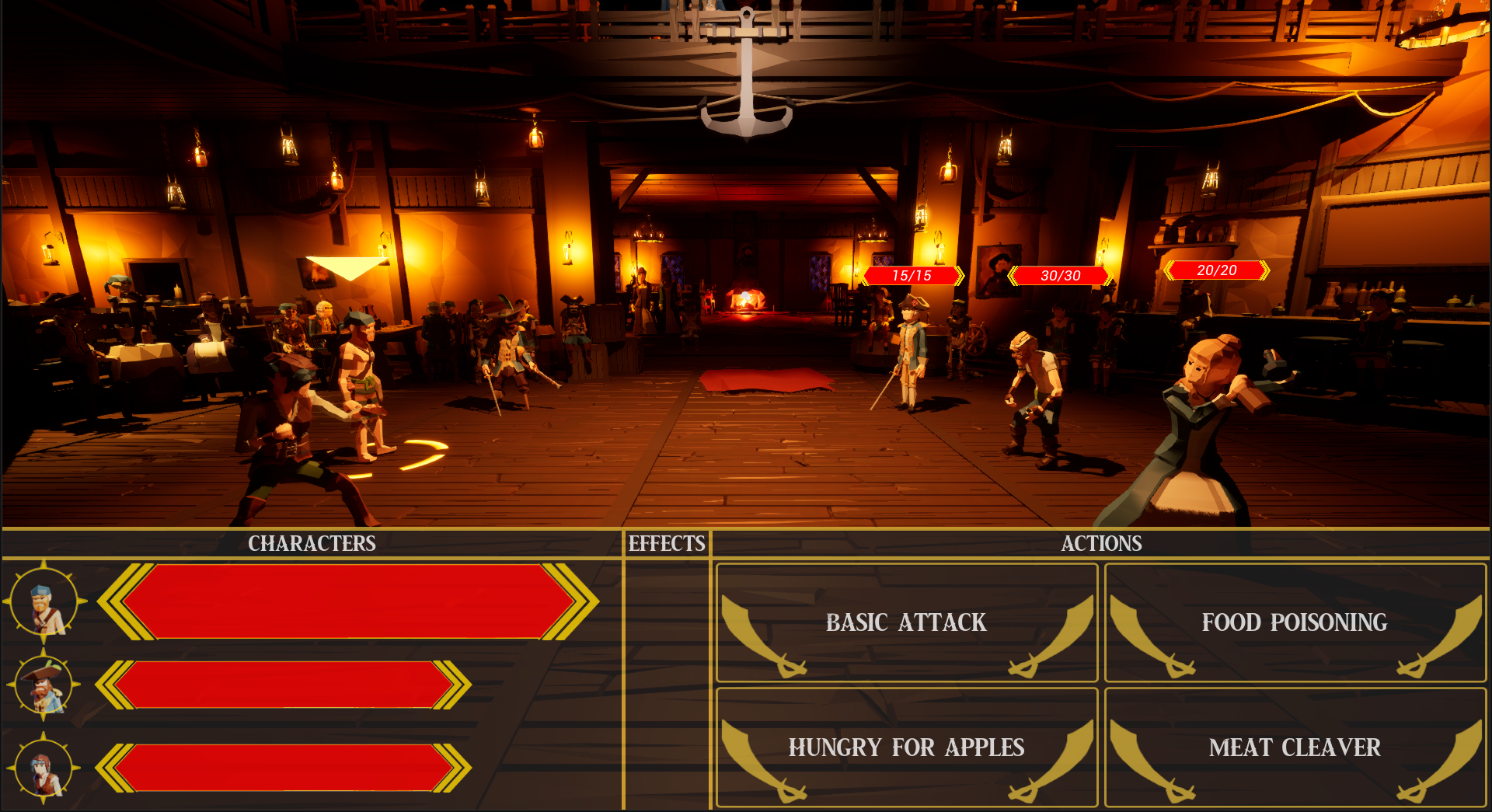
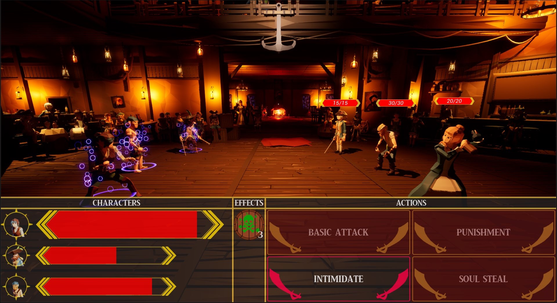
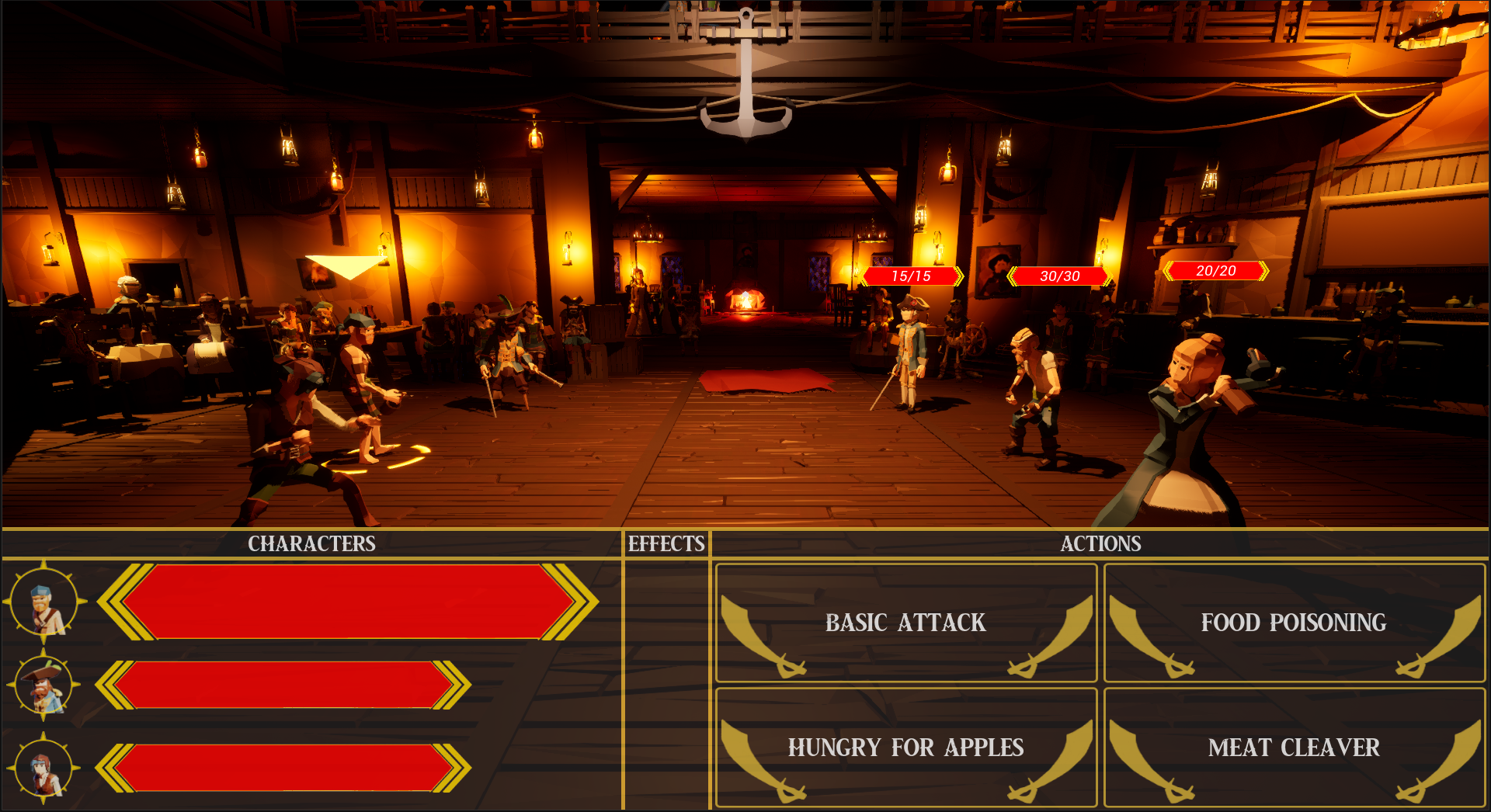
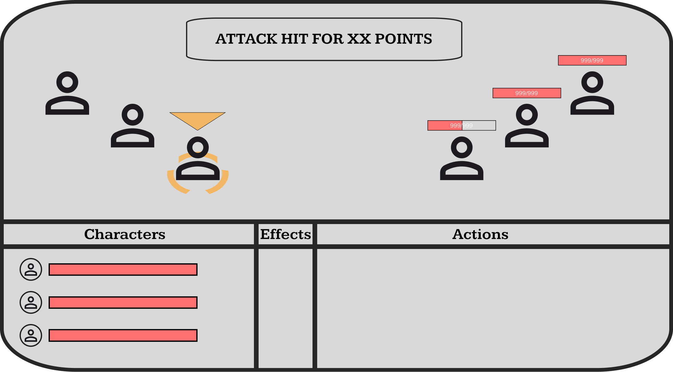
In-Game HUD
The HUD is separated into three panels; the Character panel, Effects panel and the Actions Panel. I felt that the separation of these panels was important as it made content digestion easier for players when first learning the project. Multiple iterations of the HUD were done throughout the project either due to user feedback or a change in design direction. For example, during early development the idea of “mana” or some type of points used to cast special abilities was floated around and this was incorporated into the early HUD diagrams with character vitals containing a blue bar to represent “mana”, however, that idea was later scrapped so the wireframes were changed to accommodate the mechanics.
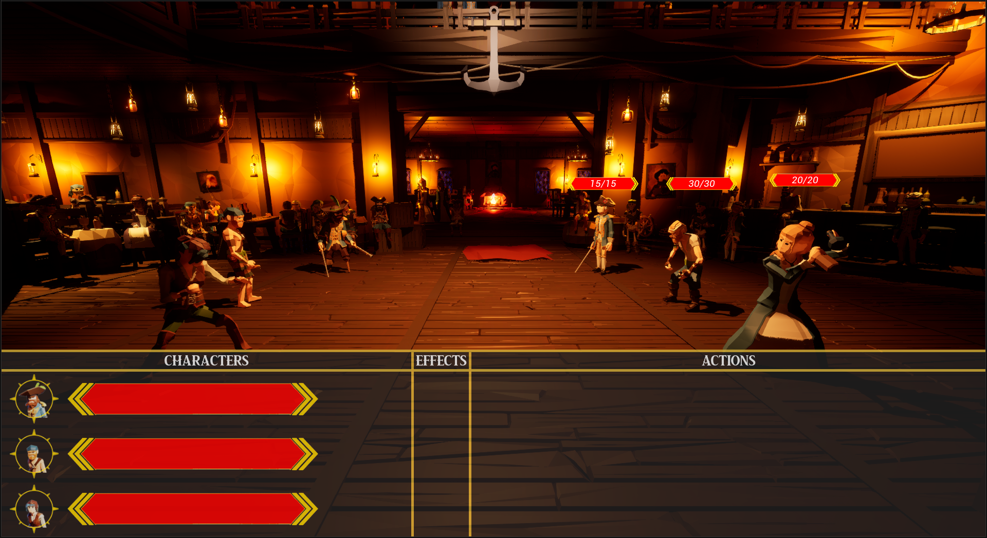
In-Game Version
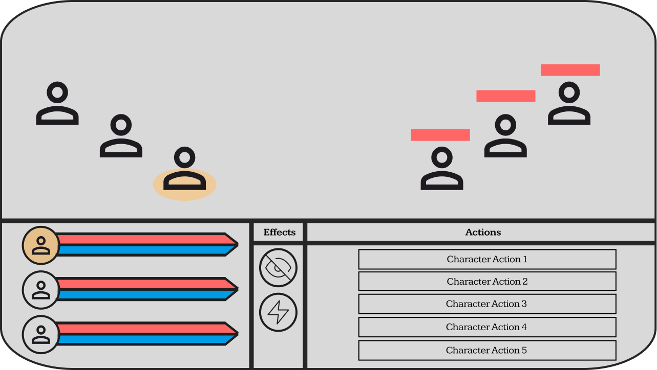
Initial Wireframe
Iterated Wireframe

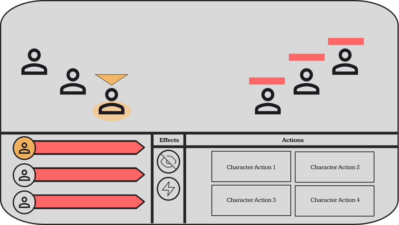
Final Wireframe
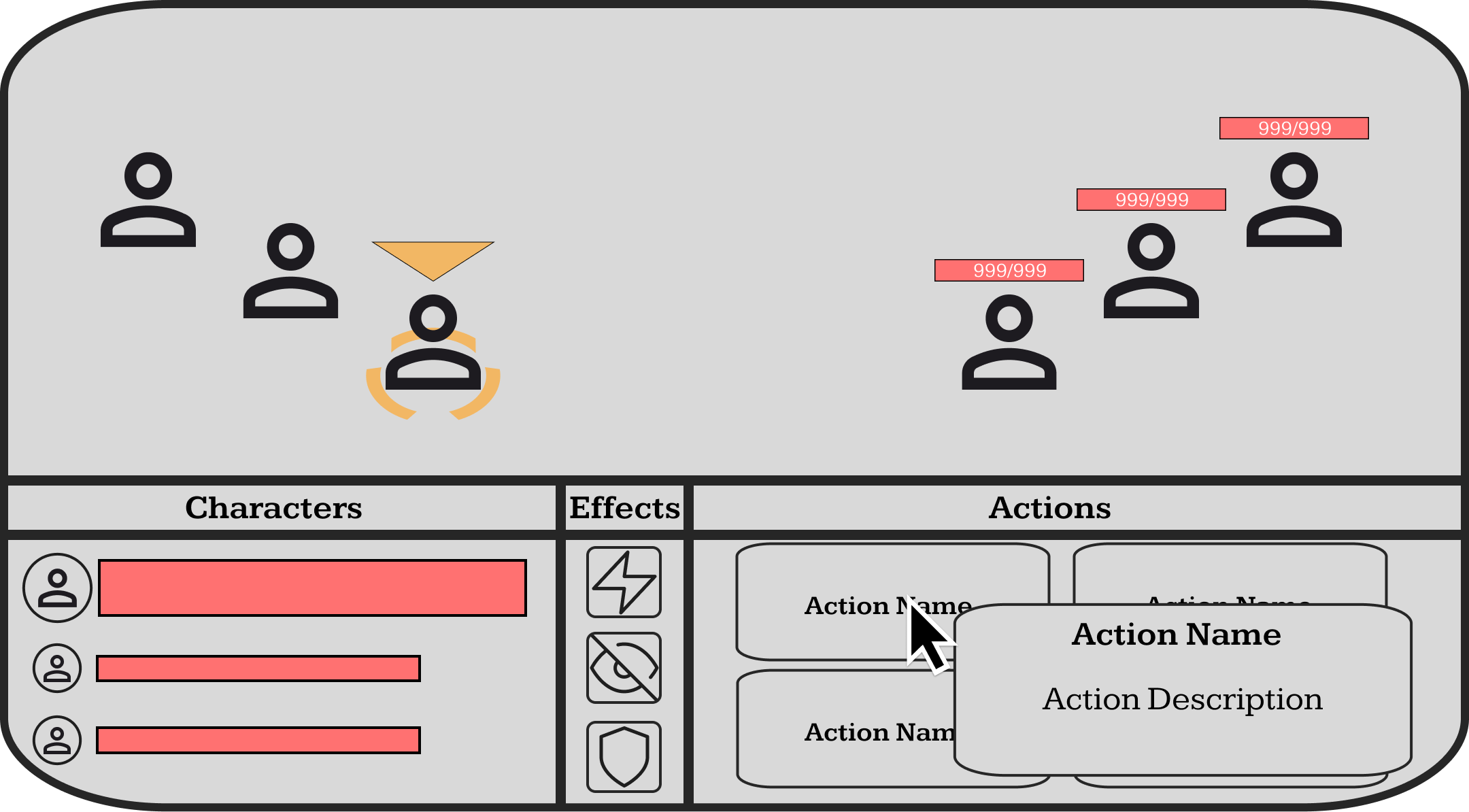
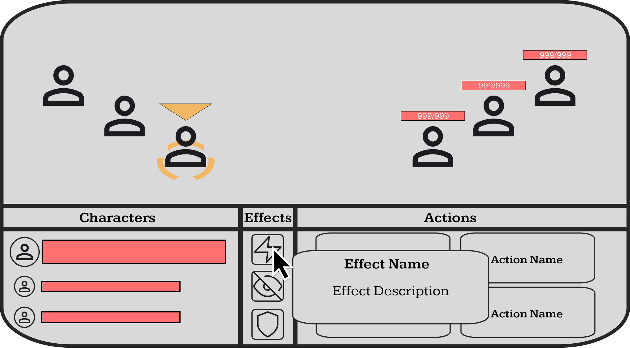
TOOLTIPS
Tool tips were used to convey information about specific attacks and effects. Since this project was a vertical slice, it meant that we didn’t have the luxury of intuitively teaching the player what certain mechanics did. In the end we settled on giving the player the ability to find information out by hovering over a widget. These features were condensed into a title and a description, so that it was easily digestible to not interrupt the flow of gameplay while still providing knowledge on what they were looking at.
In-Game Tooltip
Action Tooltip
Effect Tooltip
CHARACTERS
The characters panel contains three character vital bars which relate to the characters that the player controls. Each vital bar has a progress bar which is linked to the character’s health, and a profile image of the character that the vital bar relates to. Using a profile image to convey what bar represented what character was chosen over character names because it reduced the number of elements in the character panel and nowhere in the project would the player be introduced to the names of the characters so they wouldn’t be able to link a name to a character in their head.
When a character is selected, their vital bar is brought to the top of the panel and increased in size to provide a visual distinction between the selected and unselected characters, the in-game character will also gain an orange arrow that hovers above them and an orange circle below their feet. It was important to include multiple indicators for the selected character because a character could only do one action per turn so if the player got confused and accidentally used the wrong character then it would cause a lot of frustration of them.
In-Game Character Panel
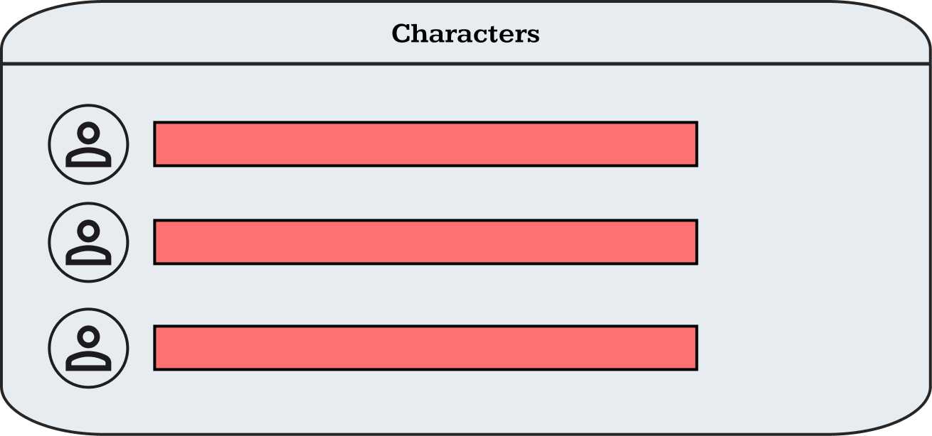
Character Panel Wireframe
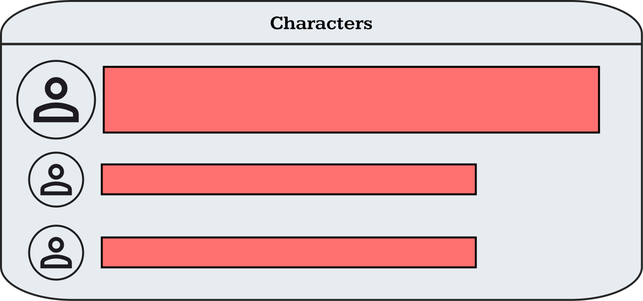
Character Selected

Character Vitals
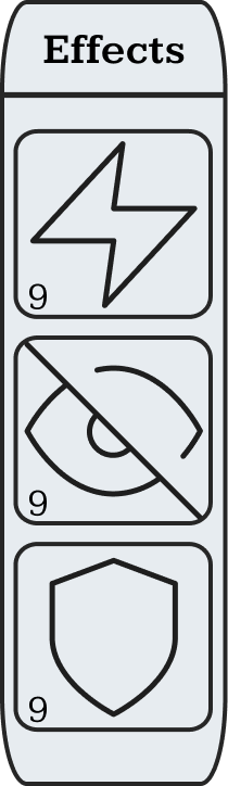
STATUS EFFECTS
Status effects play an important part of the combat game loop allowing the player and enemy characters to extend an action over multiple turns. Each character can have a max of three effect on them at once and all current effects can be seen on a character when they are selected.
When a character gains a status effect it can be seen in the status effect section of the HUD when they are selected. A status effect consists of a distinct image so that the player can easily identify at a glance and a number on the bottom left to convey how many turns the effect will last. Tooltips are also used to provide additional information to the player while keeping the look and feel of the HUD streamlined, instead of bombarding the player with information that isn’t relevant.
In-Game Status Effect
Status Effect Panel Wireframe
Status Effect Icon
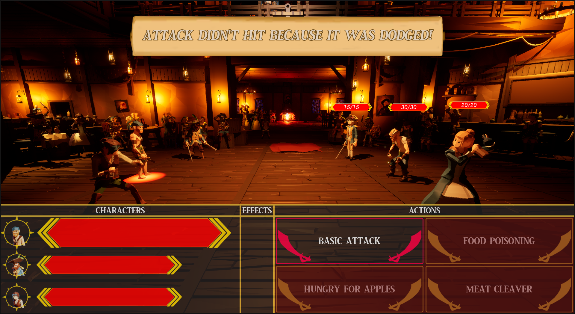
ACTIONS
A character has four actions, three of them being unique and the other being a basic attack. To represent this in game the actions are placed into a two-by-two grid separated with a border and titled actions. Depending what character, the player has selected, even enemy characters, that selected characters actions will be displayed.
Furthermore, about the action buttons, to convey when the player’s cursor is hovering over a button it will decrease the overall brightness to contrast those around it. When a player has selected one of the actions, the selected button’s border will turn a pinkish shade of red and if the player commits to that action, it will stay that way until the characters next turn. When the player has either selected or committed to an action the other buttons will have their backgrounds turn a deep opaque shade of red, which is done to convey that they are unable to be pressed.
In-Game Action Panel
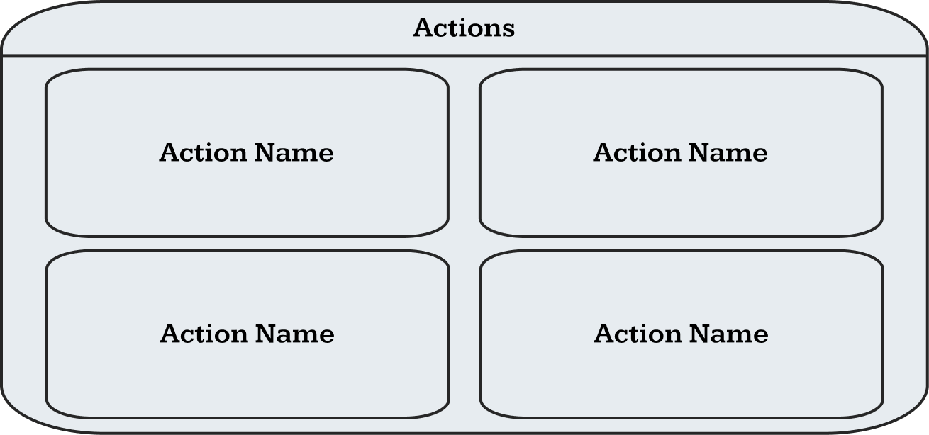
Action Panel Wireframe
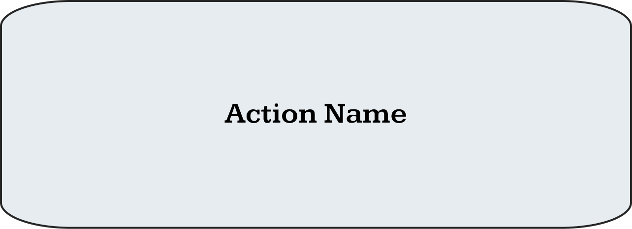
Action Button

Action Hover and Selected
Action Unavailable
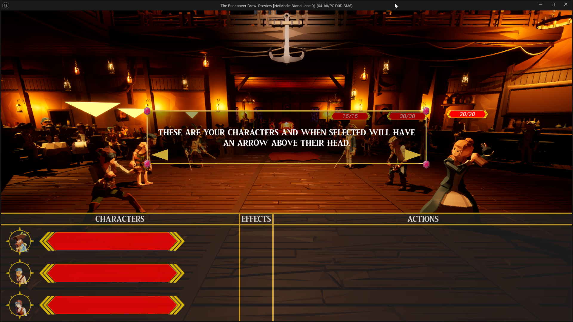
TUTORIAL
To teach the player the basics of combat the project uses an explicit tutorial where the game is broken into several slides that the player can go back and forth through, the addition of a back button was done to mitigate the chance of the player accidentally double clicking the forwards button and skipping a slide and gives them the option to return to a previous slide at any point during the tutorial.
Each slide also interacts with the game, depending on what slide is currently present on the screen. For example, when talking about the player’s characters it will show them all with a selection arrow above their heads.
In-Game Tutorial
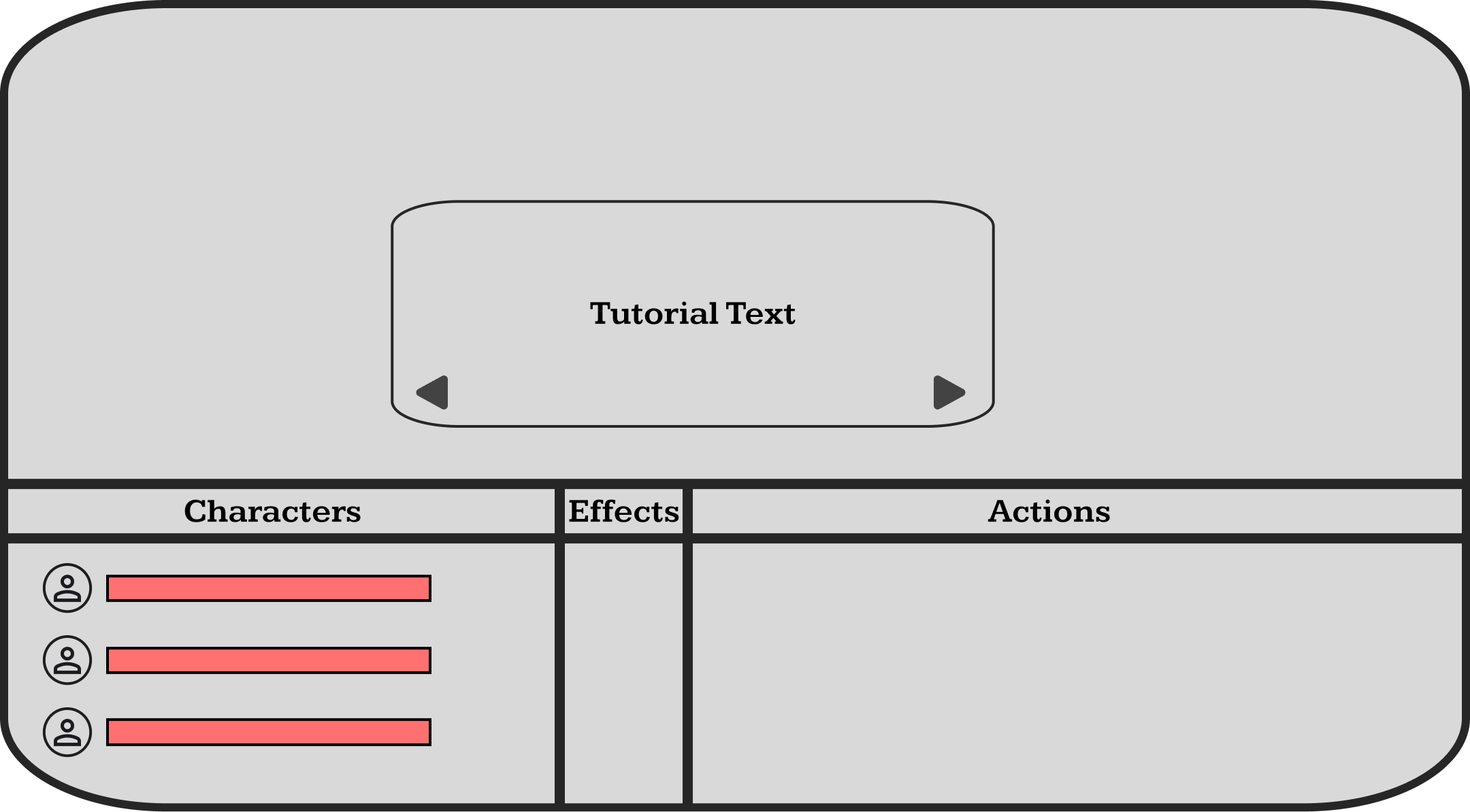
Tutorial Wireframe
ACTION POPUP
During testing we realised that users did not properly understand what effect their actions had on the enemy. When an enemy was damaged then the health bar above their head would decrease, however, after testing it was clear that it wasn’t enough to convey what was happening so the team decided that an “action popup” would help provide additional information to the player.
This popup would appear anytime a character was hit, no matter if it was friendly or an enemy. The popup would then display in text how much damage that character received and if it was a critical or not.
In-Game Action Popup
Action Popup Wireframe
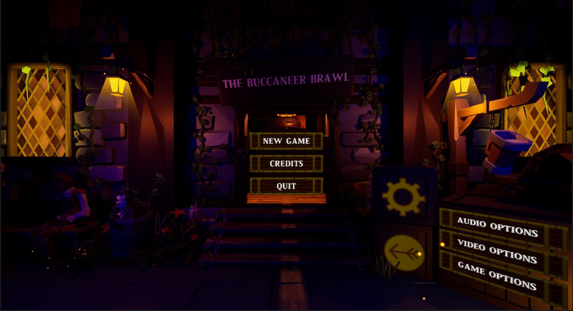
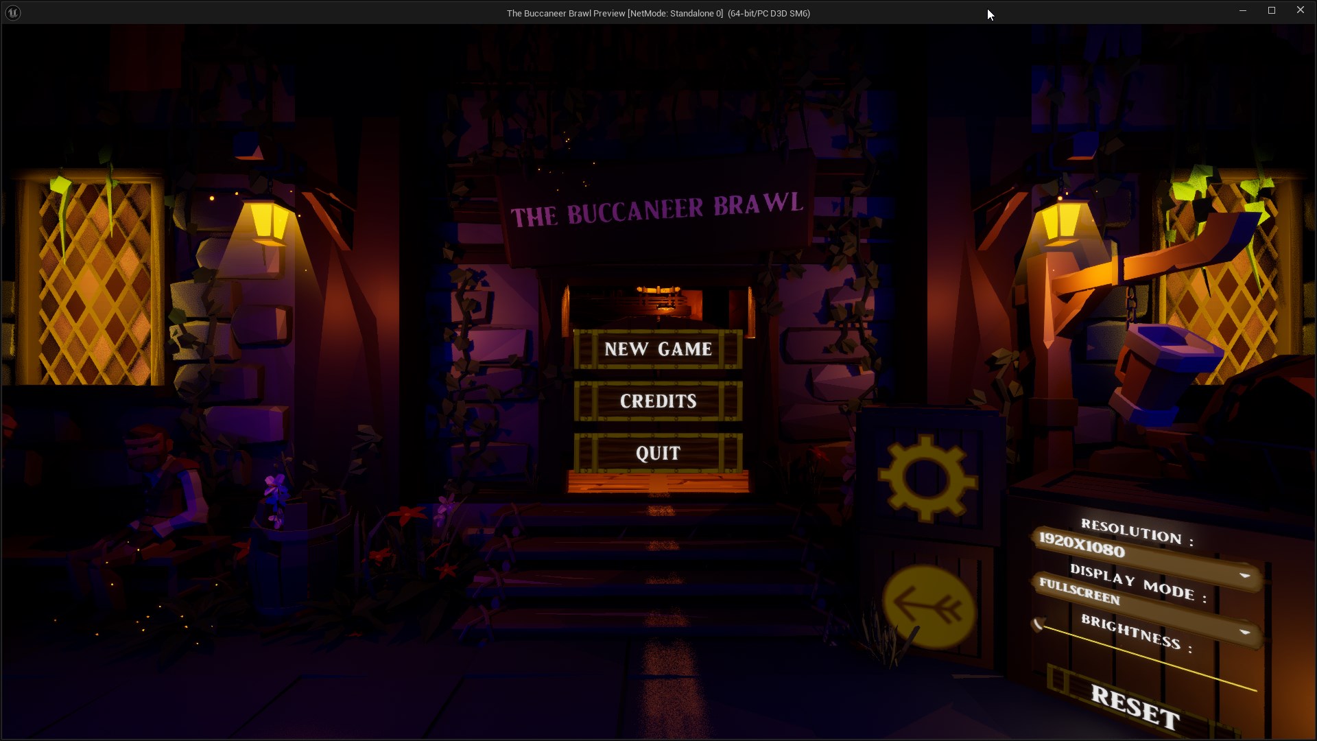
MAIN MENU
As with the in-game HUD, multiple versions of the main menu were created. These wireframes were then pitched to the team in a meeting to decide what version we would go for. However, as the project progressed iterations were made to the main menu which makes it vastly different to the in-game version. For example, we wanted a more integrated main menu with the buttons being placed over the saloon doors so that when the player pressed play the camera would move through the bar into the game. This also resulted in us scoping down the main menu with the only buttons remaining being Start, Credits and Exit.
In-Game Main Menu
Main Menu Wireframe
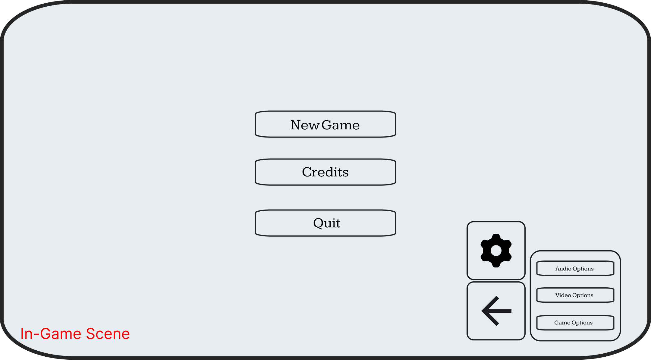
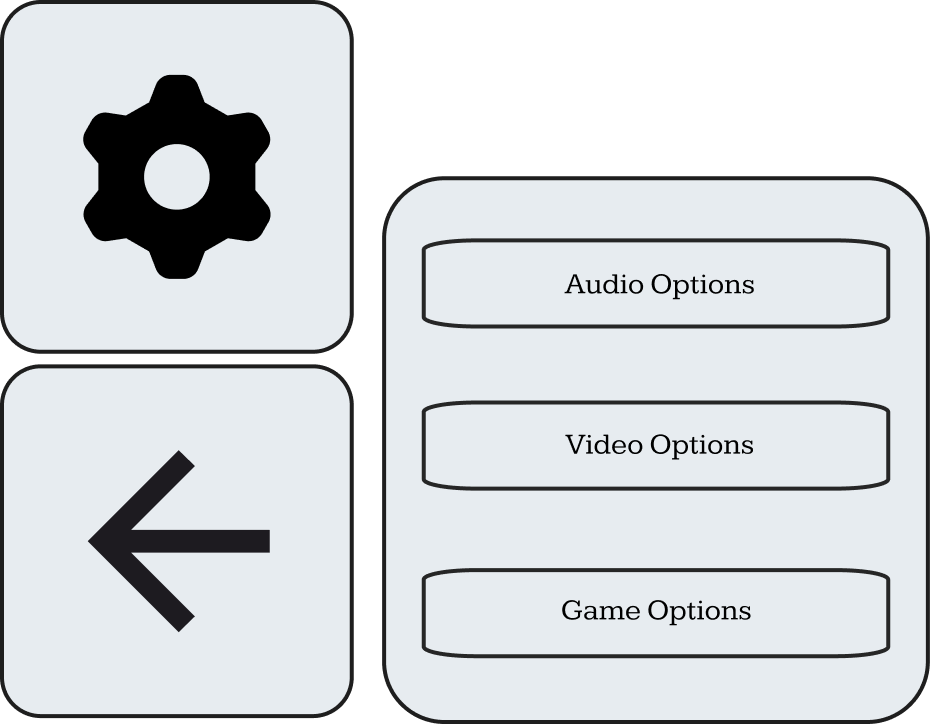
OPTIONS MENU
In-game the options menu is dietetically placed onto three crates.
The top crate has the options button, which is represented by a cog icon, when the game beings the options menu is hidden until the player presses the option button which makes the content on the other two crates visible.
The bottom left crate is the back button, when the player enters a submenu such as the video options menu or the game options menu then the player can press the back button to go back.
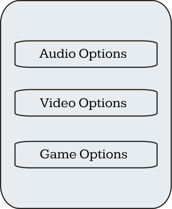
The bottom right crate contains the menu content of the current menu the player is looking at.
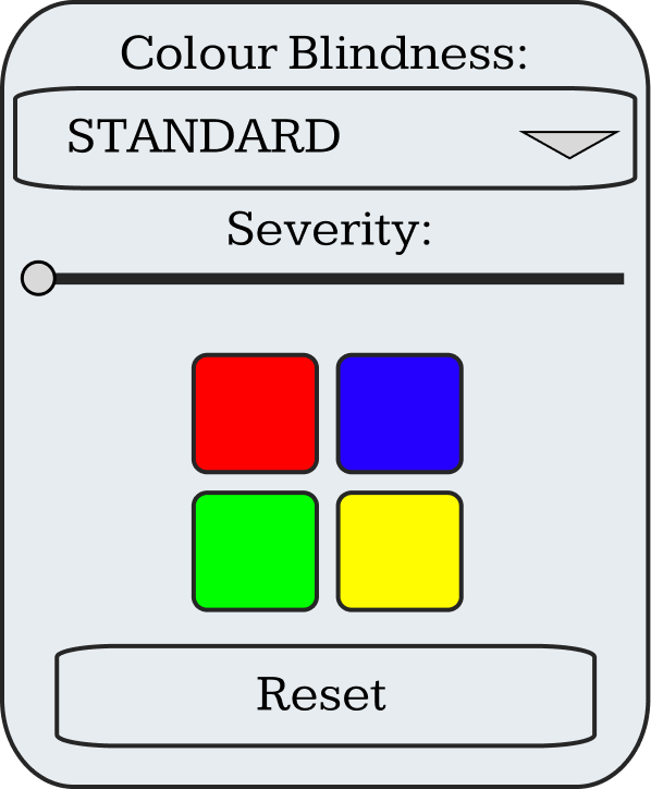
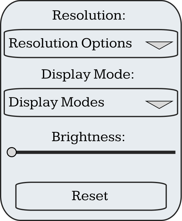
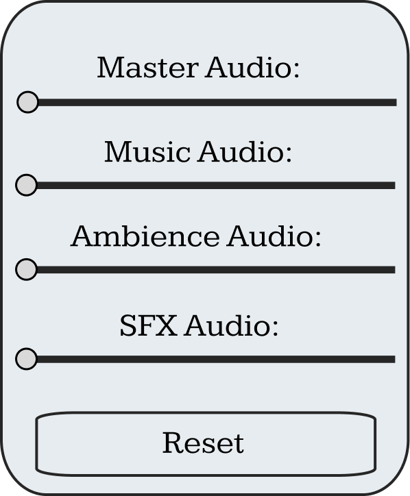
There are three menus that the player has access to which are the video, audio and game options. The most notable menu is the game options menu contains colour blindness settings where the player can choose from several colour blindness modes and alter the mode’s sensitivity. A grid of four boxes is placed at the bottom containing red, blue, green and yellow so that the player can see how the different modes effect colours as the main menu’s colour palette is mostly shades of browns and blues so may not be the most accurate portrayal of how each mode would look.
In-Game Options Menu
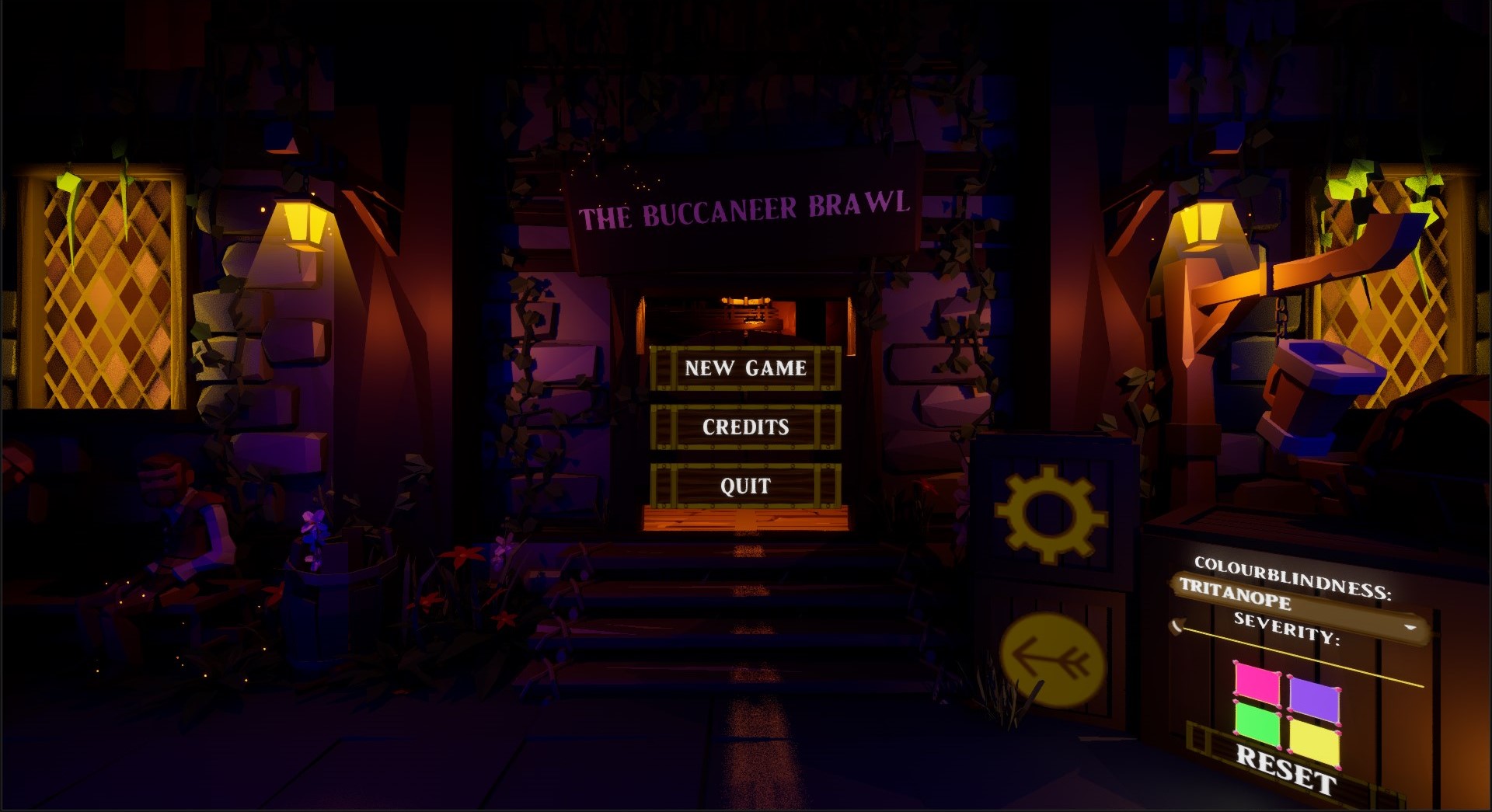
In-Game Game Options
In-Game Video Options
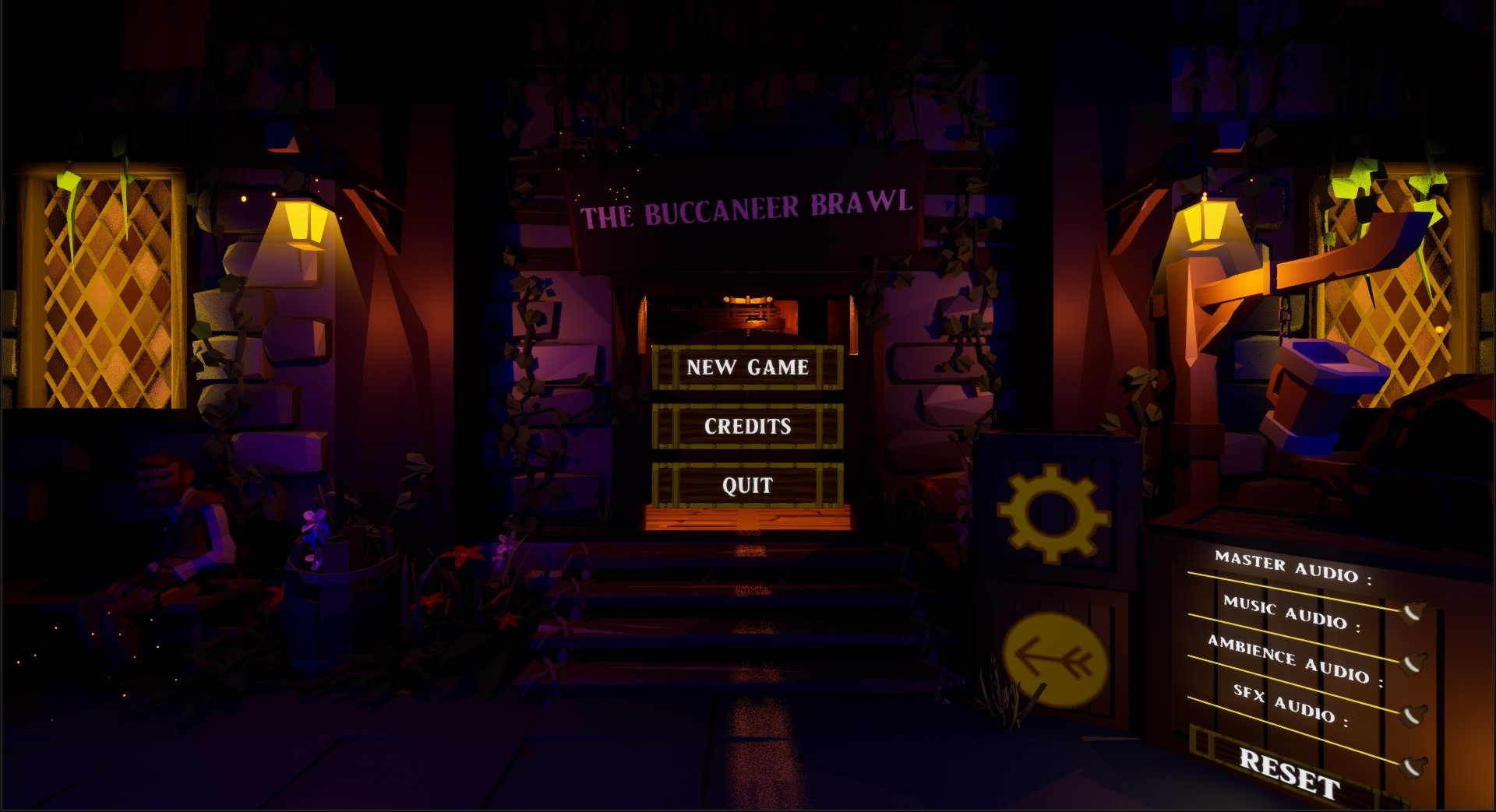
In-Game Audio Options
Options Menu Wireframe
Options Panel Wireframe
Game Options Wireframe
Video Options Wireframe
Audio Options Wireframe